This blog furnishes the intricacies of creating a pagination system for a web application. This blog post provides insights into the problem statement, process behind developing the system's components, offering a detailed exploration of design decisions and UX considerations.
PROBLEM STATEMENT
Creating a pagination system that's appropriate for a web app that hosts large chunk of data; making navigation simpler for the users.
design decisions made for component creation
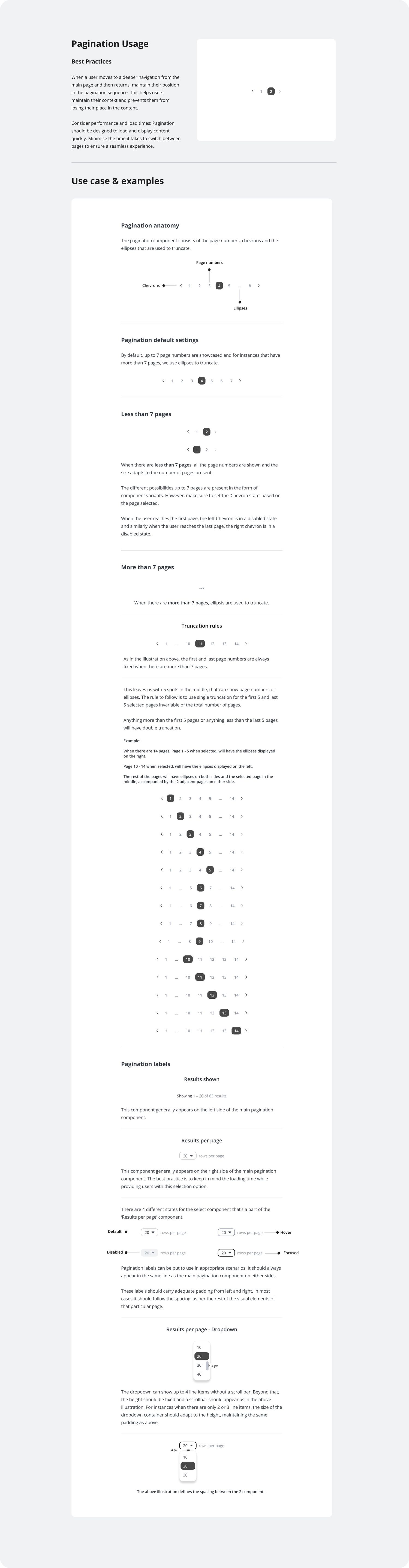
The decision on the maximum length of the pagination component was influenced by the specific use case of the web app. Given that the primary user base interacts with the application on desktops, laptops, or iPads, the component was designed to accommodate up to nine characters, including the chevrons. This configuration allows for the display of 7 pages without truncation, considering the common screen sizes.
To complement this main pagination component, the pagination section also included two additional elements: one indicating the Number of results shown per page and a Selector. These 2 elements, reduced ambiguity for the user and also provided navigation assistance. The choice to place these elements in the same row as the pagination component played a crucial role in determining the overall size of the main pagination component.
Furthermore, extensive research into the typical data volume on each page of the web app revealed that the majority of pages contain fewer than 7 or a maximum of 7 pages. This understanding of the data distribution informed the design choice for the pagination system.
Research has shown that presenting a large number of page options may increase cognitive load, potentially affecting users' interest in navigating the webpage. Therefore, the decision to limit the displayed pages to 7 aims to provide a user-friendly experience, ensuring that the pagination system remains intuitive and enhances, rather than hinders, the overall usability of the web application.
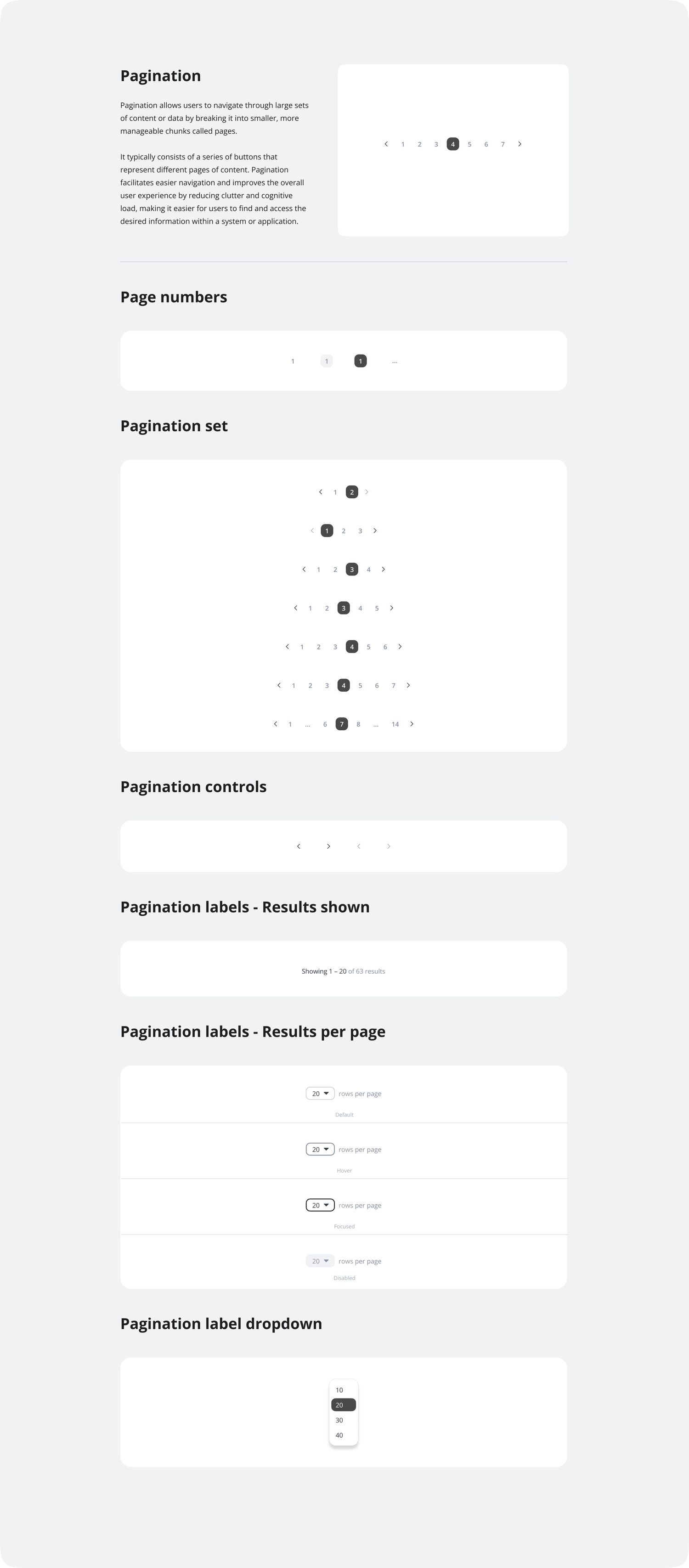
Pagination set
The pagination set component was created with 7 variants, starting from 2 pages till <7 pages. This provides for all the design variants needed for customising the pagination component according to the requirements of different pages.
The pagination set was further divided into 'Page number' components in order to allow for customisations for pages that are <7

Pagination label
The pagination label comes in handy when the user wants to have an option to view multiple line items in a single page. This component has 3 parts to it.
- Results shown label
- Selector to select no of Results to be shown per page &
- The associated dropdown menu
The selector component has 4 variants as shown in the picture.

Components created on figma
developer's guide to implement the component